Tnorx: Building a Brand That Feels Like the Future of Software
Overview
Tnorx is a Canadian based software development startup focused on building modern digital solutions. As they were growing, they needed a brand identity that could represent their vision, expertise, and the quality of work they deliver.
The goal was to create more than just a website. It was about building a complete brand experience that feels modern, trustworthy, and easy to connect with.
I worked on creating their full visual identity system, including the logo, website, marketing visuals, and supporting brand assets.
The Challenge
Tnorx had the technical expertise, but they needed a digital presence that could communicate their value clearly.
The challenge was to create a brand that:
- Feels innovative but still approachable
- Makes complex software services easy to understand
- Builds trust with potential clients
- Creates a consistent experience across every platform
The biggest focus was making sure the website was not just visually appealing, but also purposeful.
The Idea Behind The Design
The direction was built around simplicity.
Software companies often communicate with overly technical layouts and complicated messaging. For Tnorx, I wanted to create an experience that feels clear, smooth, and effortless.
Every section, interaction, and visual element was designed with intention. The goal was simple: make users understand what Tnorx does within seconds.
Creating The Brand System
I developed a complete visual language that could grow with the company.
This included:
- Logo identity
- Typography system
- Brand colors
- Visual elements
- Website components
- Marketing graphics
The system was designed to keep the brand consistent whether someone interacts with the website, social media, or promotional content.


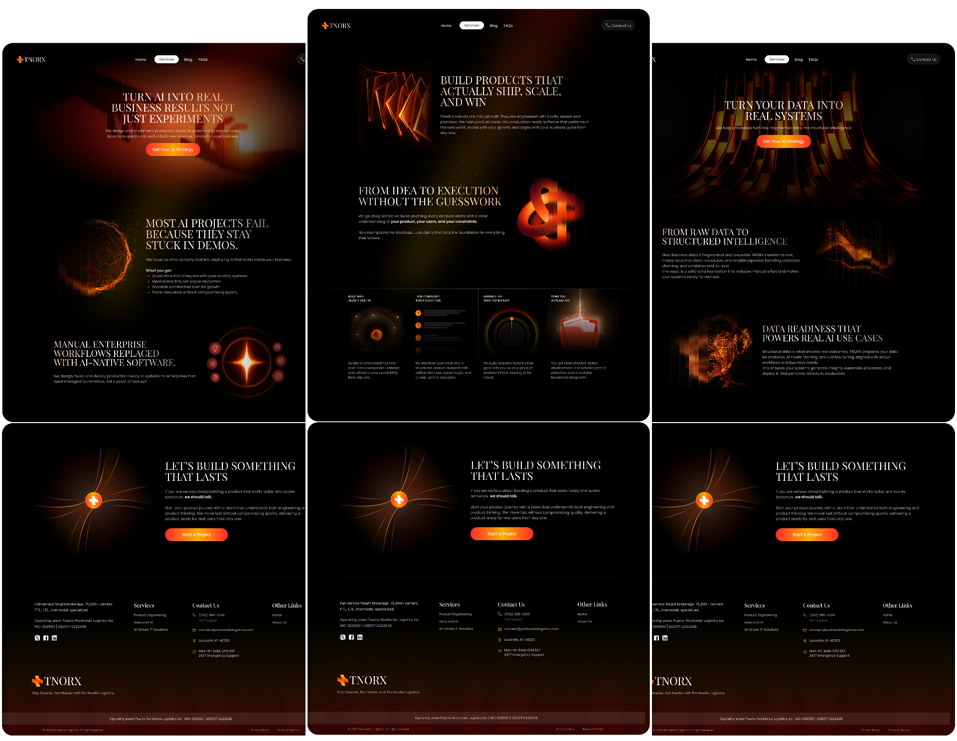
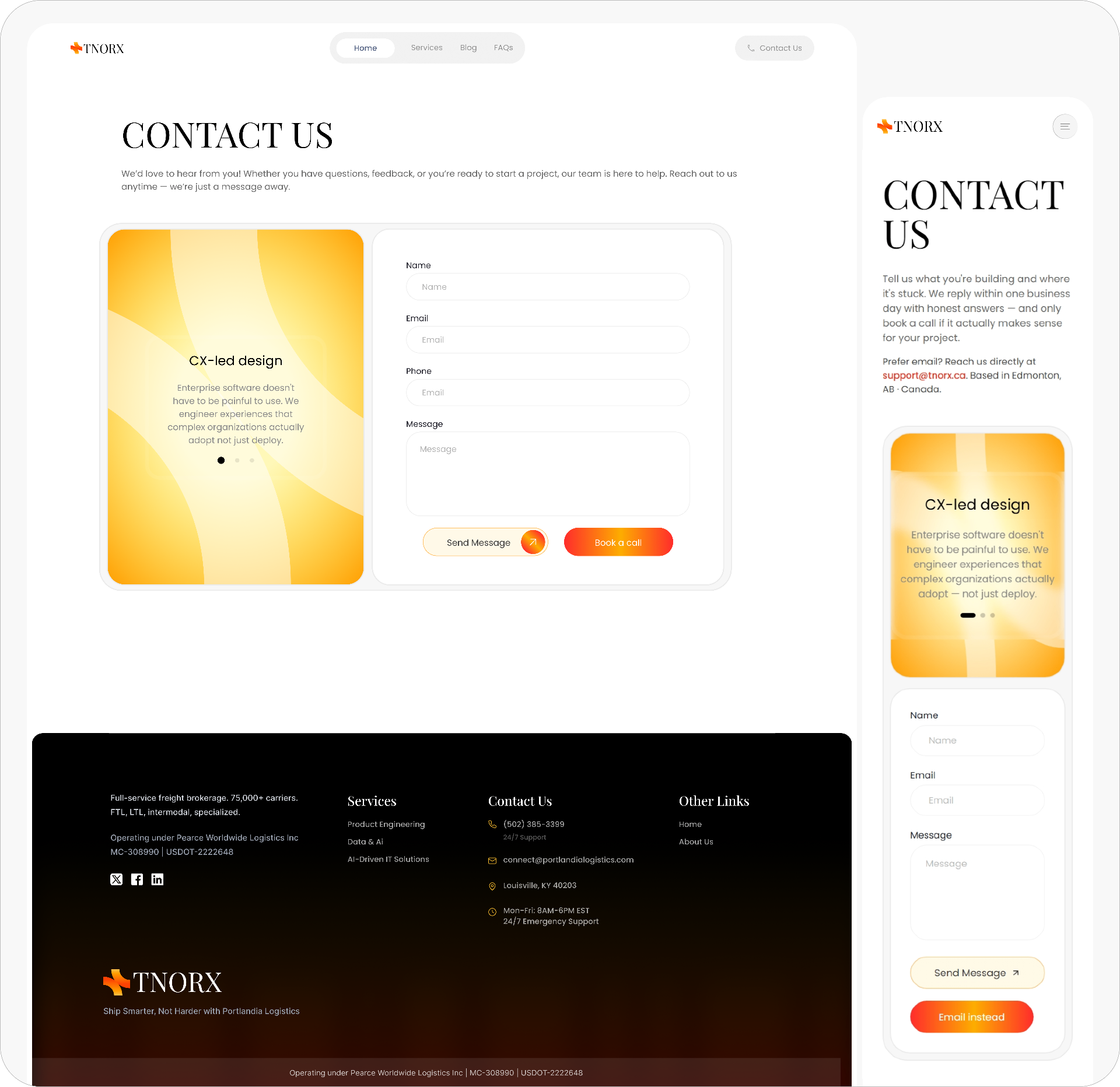
Designing The Website Experience
The website became the core of the brand experience. Each service page was carefully crafted to guide users through Tnorx's capabilities without overwhelming them.
The experience focused on:
- Clear content structure
- Smooth user flow
- Minimal layouts
- Strong visual hierarchy
- Direct communication
Instead of adding unnecessary elements, the design focused on what matters most: helping users understand, trust, and engage with the brand.
A landing page experience that speaks for brand values and vision

each service page designed with care to give premium experience
finally a contact page that isn't boring..😂
Extending The Identity
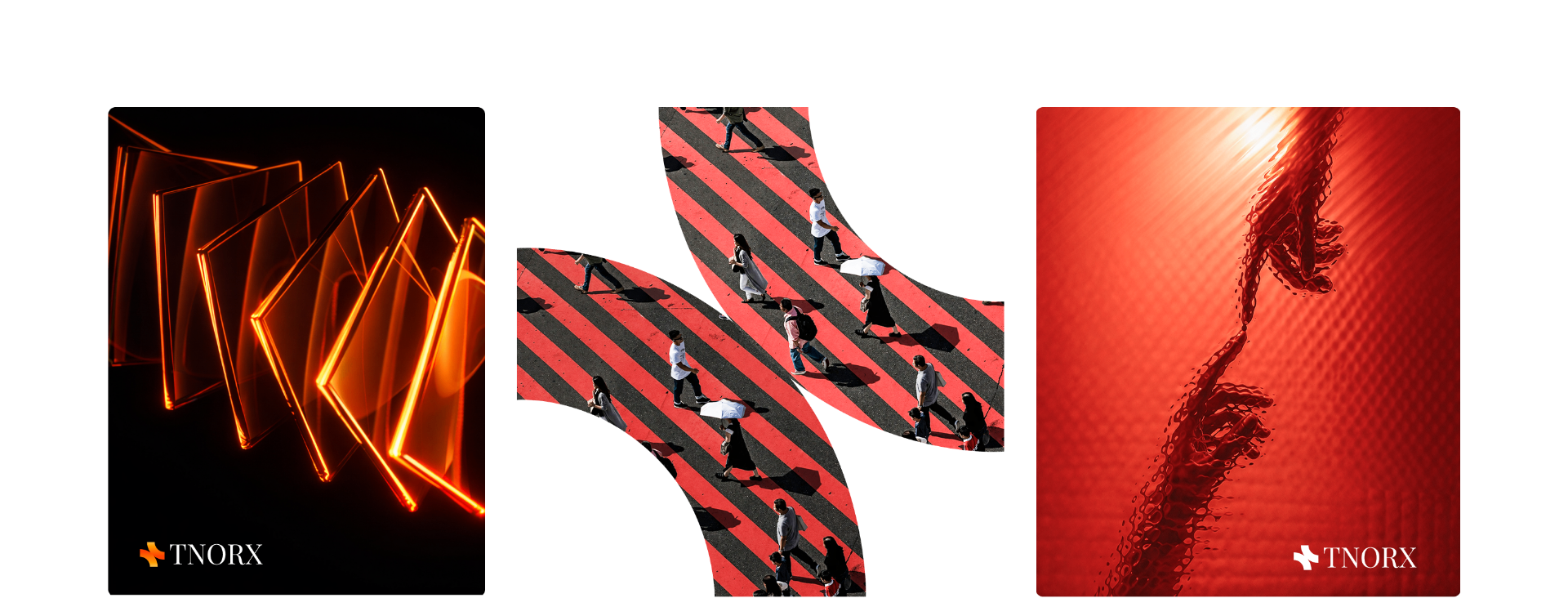
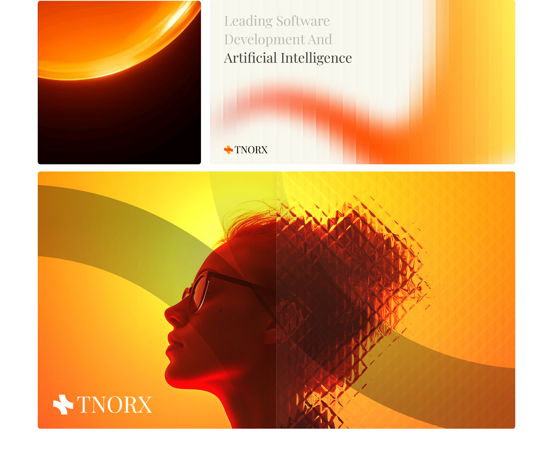
To make the brand feel complete, I created supporting visuals including:
- Website banners
- Promotional graphics
- Custom visual assets
- Reusable design elements
This helped Tnorx maintain a strong and recognizable presence across all digital touchpoints.

Outcome
The final result was a complete digital identity that gave Tnorx a modern foundation to represent their software solutions.
The brand now communicates:
- ✓ Innovation
- ✓ Trust
- ✓ Simplicity
- ✓ Technical expertise
- ✓ A premium digital experience
Final Thoughts
This project was about creating a brand that does not just look good, but feels intentional. Every design choice was made to create a smooth experience where users can quickly understand Tnorx, connect with the brand, and take action.
No way you scrolled all the way down this nonsense 😂 As a reward, contact me so I can host you for dinner at this cozy house
 Book a free call